
Updated on September 28, 2023 by Hannah Werntz
Best Practices for Writing, Designing, and Building Web Pages
Writing, designing, and building web pages can be a daunting task. The numerous elements involved such as the homepage, headline, brief introduction, navigation menu, and call to action (CTA) require a deep understanding to create effective and efficient web pages.
Homepages are arguably the most important and likewise the trickiest part of websites. This is because they are the most visible and most frequented pages, catering to the most diverse array of traffic. When designing a homepage, the goal is to quickly orient visitors and encourage further website exploration. Homepages must also meet various other technical and legal requirements, including search engine optimization, load speed, mobile-friendliness, data analytics integration, privacy law compliance, accessibility, easy updates, and consistent branding.
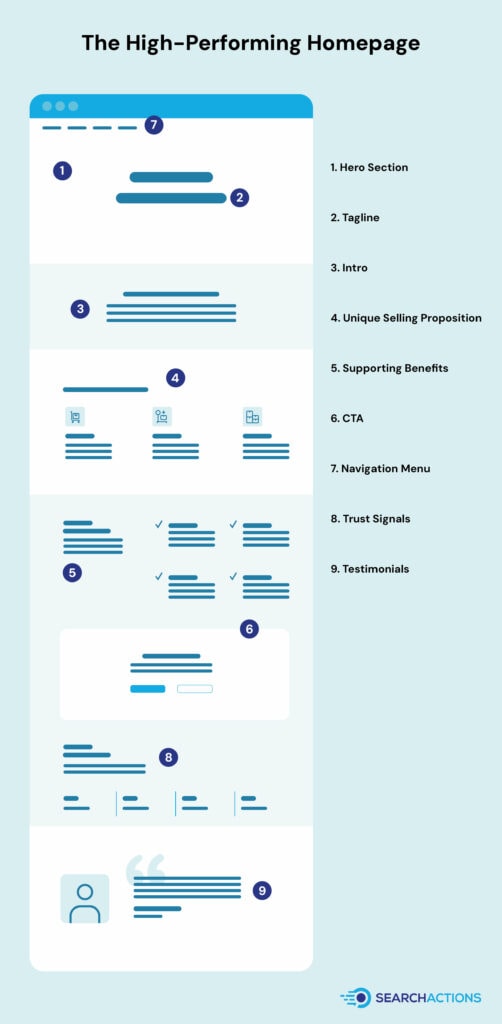
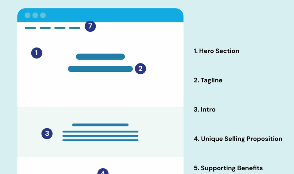
1. Win Them Over Starting with the Hero Section
The hero section of your website is the “above-the-fold” space that first grabs a visitor’s attention. This could incorporate eye-catching typography, an enticing image slider, a vibrant hero image, a captivating video, or more, all aimed at engaging the visitor at first glance. The purpose of the hero section isn’t exclusively about showcasing a main character or product; it can be an abstract design or a thematic image. Its central role is instantly capturing attention and inciting the visitor to explore more, facilitating an immediate visual, emotional, and informative connection with the user.
2. Simplify Initial Messaging
At the top of this visual hierarchy lies the headline. The headline, usually formatted with the <h1> header tag, should quickly inform both visitors and search engines about the nature of the website. An effective headline should:
- Be clear and descriptive
- Comply with the Backyard BBQ Test (if you told someone at a BBQ what your site does using your headline, would they understand?)
- Include target keyphrases for SEO purposes.
“If people have to stop and think about the meaning of the words in the sentence, then you will lose them. Don’t make users think; they have other options a click away. Users won’t their friends about your amazing headline; but they may tell their friends about your amazing service or product. But you have to get them as a customer first, and a logical way to do that is to tell them very clearly what you do, the benefit to them, and how to get started.”
– Cam Fulton, owner of SearchActions Digital Marketing Agency
3. Inform in the Intro
Following the headline, a brief introduction should summarize the business’s unique value proposition. This can be challenging due to the need to position the business within a category while also establishing differentiation in a few sentences. If you find yourself drafting a clever headline, consider placing it here and ensuring your headline remains clear and straightforward.
A question that we like to ask ourselves around here when writing copy: “How would you explain it to a friend at a barbeque?” Keep it simple, understandable, and to the point. “The headline should be concise, clear and explain exactly what you do. Clarity over Creativity. Creativity in copywriting = confusion,” is how Cam puts it.
4. Focus on One Unique Selling Proposition
Your unique selling proposition is essential to your website content strategy as it articulates your product or service’s distinctive value. This proposition should be communicated succinctly on your landing page so that visitors immediately understand what sets your offering apart. Elements that tell the story of your unique selling proposition include the main headline, which should directly and clearly illustrate your product or service’s benefit to your visitors.
5. Support the Unique Selling Proposition
Your product or service’s benefits answer the crucial question, “What’s in it for me?” while advantages highlight superiority over competitors. Both play pivotal roles in linking your offering directly to the customer’s needs, desires, or pain points, driving conversions.
Advantages: These are unique features or aspects of your product or service that make it superior to competitors. An advantage could be the use of exclusive technology, superior customer service, or a more efficient process. By elucidating these aspects, you highlight why your offering stands out and is the best choice.
Benefits: These focus more on the customer and the value they receive. They answer the crucial customer question, “What’s in it for me?” For instance, if your software has a user-friendly interface (feature), the benefit could be the customers’ ability to save time and reduce the learning curve. Benefits are usually the direct outcomes of the features or advantages and are essential to make them relatable to the customer’s needs or wants.
Ultimately, the power of advantages and benefits resides in their ability to link your product or service directly to your customers’ needs, desires, or pain points. They shine a spotlight on why a customer should choose your product or service over others, thus influencing their decisions and promoting conversions.
6. Make the Call to Action (CTA) Pop!
Include visually prominent call-to-action (CTA) prompts for visitors who are ready to interact. Make sure your CTAs convey exactly what users will gain from clicking. These CTAs can include ‘Get Started,’ ‘Get a Quote,’ and ‘Shop Now’ and should be in contrasting colors, adjacent to whitespace, and in higher visibility areas such as the main site navigation.
Your Conversion Goal or Call to Action (CTA) is most critical on any landing page. The bland, generic button text such as “CLICK HERE” or “SUBMIT” should be replaced with engaging, conversational language that exactly conveys what users will gain from clicking. Simultaneously, keeping forms short and including privacy statements for data security reassurance can improve user engagement. These CTAs, due to their direct impact on conversion rates, are ideal elements for A/B Testing methods.
7. Reading Should be Easy on the Eyes
Text color, on the other hand, should be easy to read and should not blend in with the background. For example, instead of using light grey on a white background, opt for dark grey or black. Err on the side of user experience rather than the visual appearance of the text. The recommended contrast ratio between the text color and the background should be around:
- 4.5:1 for normal text
- 3:1 for large text and graphical element
You can check the contrast between two colors using this simple tool online.
Another factor that influences readability on a website is capitalization. Try to be as consistent as possible with capitalization in headlines and buttons. If the headlines use Title Case (first letter in every word capitalized), then stick with Title Case across the site for all of the headlines. For buttons, same rule; stick to one type of capitalization for all buttons throughout the site. The only exception to this is to put the main call to actions in UPPERCASE and the other buttons be Title Case, but for headlines, they should generally be as consistent as possible.
“Our rule of thumb is always to view a website from the user’s perspective. Getting creative with the layout can cause frustration for users. Always look at the design from a usability perspective, not a “does this look good” perspective. Some things may look really good, but aren’t the best way to read, understand, skim, or consume the most important pieces of content.”
8. Intuitive Navigation Menu & Links
Navigation menus, ideally horizontal ones that collapse into a mobile hamburger icon, help visitors quickly scan and locate needed information. Some tips for designing them include:
- Use specific navigation labels that tell the visitor and the search engine what you do.
- If using dropdowns, implement big dropdowns or mega menus for lesser visual friction and greater user experience benefits.
Creating effective web pages requires attention to detail, clever copywriting, thoughtful design, and constant optimization. By focusing on these elements and keeping user experience at the forefront, you can create compelling websites that drive engagement and conversion.
When it comes to link color and format, stick to what people are familiar with – bright blue and underlined text. Text links should be underlined so that people know it’s a link. And, If you’re wondering what shade of blue to use, we recommend the same shade that Google uses in the search results! That’s because it’s what people are going to be most familiar with.
It also matters which words are being linked. The linked text (anchor text) should tell the visitor where they are being taken to and should be as specific as possible. For example, instead of saying “Learn more”, the link text should be more descriptive and say “Learn more about grey dogs.”
9. Build Trust with Visuals
Building trust with website visitors is vital, and trust signals are a crucial tool to do this. These can range from logos of recognized trade organizations to more subtle testimonials, all designed to reassure prospective customers about the integrity of your company. Although diverse in appearance, all trust signals aim to augment customer confidence while improving conversion rates.
In terms of cognitive behavior, trust signals capitalize on phenomena such as “zero-risk bias” and “confirmation bias”. The former describes how people prefer scenarios that eliminate all perceived risk, such as compelling money-back guarantees. The latter indicates that if a customer is invested in making a purchase, any cues confirming their decision can be powerful motivators. As such, trust signals help convey a website’s credibility and amplify pre-existing biases, convincing customers to follow through with their buying intentions.
10. Cementing Trust with Social Proof and Testimonials
Implementing social proof such as testimonials on your website provides the human validation that many visitors need to trust your product or service. Testimonials work wonders due to the conformity bias, leading visitors to align their actions with others. Place testimonials adjacent to the related content and make them as personalized and human as possible. Use a quote as the subheader for added impact and refrain from using testimonial carousels, as visitors are less likely to interact with them.
11. Don’t Reinvent the Wheel
Incorporating familiar features, functions, and layouts can significantly enhance the user experience when designing a webpage. This is because users feel more comfortable navigating an interface that operates in a way they’re accustomed to. This familiarity eliminates the learning curve, allowing users to interact intuitively with your site.
“Stick to what people are familiar with. It’s okay to be creative with design if you think it will present the information in a way that is easier to consume, but remember that people are creatures of habit and like things that are familiar to them. For example, people are used to the navigation at the top of the site. Don’t put it at the bottom.”
Efficiency: Conventional designs help users quickly find the information they’re looking for. Using familiar button placements, icons, and menu structures enhances usability and makes your site’s navigation more efficient.
Confidence: Web design that aligns with known standards can help build trust. If your site behaves in ways that users expect, they’ll likely feel more confident interacting with it and sharing their information.
Reduced Cognitive Load: Familiar designs minimize the cognitive load on users. Cognitive load refers to the amount of mental effort required to navigate your site. When interface elements work in expected ways, it’s easier for visitors to accomplish their goals.
So, while creativity and uniqueness are important in web design, you must balance innovation with user conventions and expectations. This ensures that while your site is visually captivating and memorable, it is also clear, easy to use, and efficient for your audience.
12. Function over Frills
Developers should build with the intention of making a users life easier and improving the speed at which a visitor can consume the content and take action.
“Yeah, animated objects flying in and out and moving around the page is fun to build and other developers will love it. But will visitors to the website love it? If something slows down the site or makes it harder for them to consume the content, then it defeats the purpose. Plus, a bunch of things flying around the page is distracting.”
Developers should be focused on building functionality that makes it faster and easier for users to find the answers to the questions they have and crystal clear how they can get started.